Poster
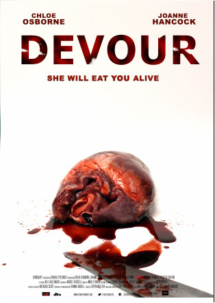
Final Poster for DevourWe decided to create a stylish and simple poster for our teaser trailer, Devour.
The final product is highly stylised and choreographed, with inspiration taken from the Saw series, particularly Saw and Saw VII. We paid homage to the solid white background that they use because we felt that it gave a sense of innocence whilst making the deep Red blood look more intense. Furthermore, we felt combining the bleak coloured leg from Saw with the empowering blood from Saw 7 was effective in highlighting the horror genre. Our decision to use a white background with a simple design came from the research we completed. This showed that horror films, such as The Last Exorcism and Dexter, had both begun to use such designs. DS |
|
|
Upload from school on Monday (24th)
|
Poster ConstructionAs part of our poster creation we used Photoshop and an online picture editor, Pic Monkey. To the left is the process of layers involved in creating the final poster.
DS |
Magazine
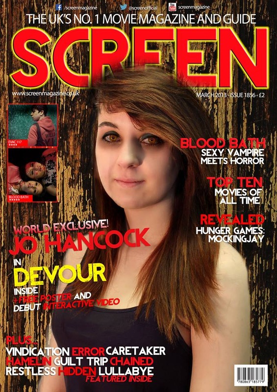
Final MagazineOur final magazine design was derived from studying real life examples, such as Empire, whilst clearly defining and creating a unique product.
We decided to use the actress on a magazine style because we felt that it allowed the audience to engage with the actress as a person, rather than just a character. In our design we decided to use a wooded background because we felt that it was more eye catching than traditional magazine backgrounds. This, combined with different coloured and gradient fonts to highlight keywords, means that the magazine would attract the audience easier. Furthermore, to appeal to a modern audience and the web 2.0 generation who form most of our target audience, we have included a range of interactivity opportunities such as Twitter. DS |
|
|
Upload from school on Monday (24th)
|
Magazine ConstructionAs part of our magazine creation we used Photoshop and an online picture editor, Pic Monkey. To the left is the process of layers involved in creating the final magazine.
DS |
