Font Choices
DS
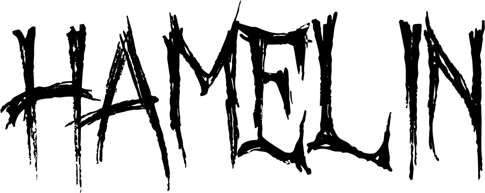
In the same way that current Horrors are being named with single word titles, they are also using basic font styles.
When considering this in creating our teaser trailer we decided that the font Tahoma would be a very effective brand element. To ensure that the font didn't create a 'bland' branding, we decided to edit it by using the burn tool in Photoshop and then rubbing away certain parts to imitate the look of someone having eaten parts of the font and the dirt from the forest.
DS
Font Choices (First Idea)
|
When we were planning our film, we thought that the font "October Crow" would be really great. This is because it has a halloween aspect within it, which we thought would work well with our film due to its childlike nature.
However after doing some research and changing our idea for our trailer, we decided to use a simple font that makes the trailer look classier and more professional. SS |
|
DS
